As of February 12, 2010, there's a new way to identify stock options which should make it easier to identify what option we're dealing with just by looking at the symbol. I think it's best to take a few examples to see what the new symbols are.
Let's look go into the option quotes at The Options Industry Council, choose a few stock option symbols and see if we can decipher them:
YHOO101218C00016000
YHOO means YAHOO INC (NASDAQ)
101218 means that the stock option expires on 12/18/2010
C means that it's a call option
00016000 is the strike price: 16.0 dollars
IBM101210C00140000
This is an IBM (NYSE) option call that expires on 12/10/2010 with a strike price of 140.0 dollars.
F101218P00016000
This is a FORD (NYSE symbol F) option put that expires on 12/18/2010 with a strike price of 16.0 dollars.
Gotta say that it's much better than the old stock option symbol with the cryptic code letters. Change is good in this particular case.
Showing posts with label Stock School. Show all posts
Showing posts with label Stock School. Show all posts
Thursday, December 9, 2010
Saturday, October 17, 2009
Limit, stop and stop limit order
Most people are familiar with the market value order and probably the limit order, but things get probably blurry when it comes to stop orders used in combination with limit orders. So, let's look into those different types of orders when you are either buying or selling a stock. Trust me, it's really not rocket science and the best part is that it's here to protect your assets.
Limit, stop and stop limit when buying a stock
Buy limit order
When you issue a buy limit order at a certain price, it means the order won't be filled until the stock goes below that price. In other words, the stock has to go down in price to reach your limit before it is filled.
Buy stop order
When you issue a stop order, the stock has to go up in price past the stop before the order can be filled (at market value).
Buy stop limit order
The stop limit order is a combination of 2 orders, the limit order being triggered once the stop order is filled. In a buying situation, the stop order is filled once the stock price goes above your stop. The limit order is then triggered and the broker will fill the order only if the stock price is below your limit.
The goal is to buy a stock on its way up but not at too high a price. Say you have an eye on some stock currently priced at $20. You place a stop limit order at $22 for the stop and $23 for the limit. If, the next day, the stock opens at $22.5, the stop order is filled and the limit order is filled as well. If the stock opens at $23.5, the stop order is filled but the limit order is not.
The stop limit buy order is to protect you against huge gaps on the upside and paying way too much for a stock.
Limit, stop and stop limit when selling a stock
Sell limit order
When you issue a sell limit order at a certain price, the broker won't fill it until the price goes up past that limit.
Sell stop order
When you issue a stop order, you are telling the broker to sell the stock when its price goes below the stop (at market value). It is a way of protecting your gains and is often referred as a stop loss order.
Sell stop limit order
The stop limit order is a combination of 2 orders, the limit order being triggered once the stop order is filled. In a selling situation, the stop order is filled once the stock price goes below your stop. The limit order is then triggered and the broker will fill the order only if the stock price is above your limit.
The goal is to sell a stock on its way down but not at too low a price. For example, say you set a stop at $20 and a limit at $19 on a stock currently trading at $21. If the stock opens the next day at $19.5, the stop order is filled and the limit order is filled as well. If the stock opens at $18.5, the stop order is filled but the limit order is not.
The stop limit sell order protects you from huge gaps on the downside, and selling at too low a price.
Saturday, August 29, 2009
Double bottom pattern criteria
Let's talk about how to spot double bottom patterns on daily stock charts. Remember that I use a program to auto-magically detect those babies, which means I can't rely on actually (physically) looking at a daily chart to see the pattern. The criteria I use are based on the only information that's available, that is, the daily closes over a period of time, say, the last 6 months.
Ok, here we go then:
First of, you don't want to look at the actual daily prices to detect patterns automatically. You need to smooth the data with some kind of averaging. I personally use a Fourier transform to "smooth out" the daily prices, but I am sure there are other ways to do it.
Since I am satisfied with an incomplete double bottom patten, the trends I am looking for are a 1st downtrend, an uptrend and a 2nd downtrend, in that order. A complete double bottom pattern would require a 2nd uptrend after the 2nd downtrend that goes past the uptrend high.
The 1st downtrend should be long enough. I require a downtrend lasting at least 20 days. That's 4 weeks of trading so it could be reduced to maybe 15, if deemed too long.
The uptrend and 2nd downtrend should be long enough. I need them to last for at least 10 days, when combined.
The lows of the 1st and 2nd downtrends should be close to each other, say, within 4%.
The uptrend high should be high enough, say, at least 10% higher than the lowest lows of the 2 downtrends.
Last but not least, the daily volume should be at least 400,000 shares. I know it has nothing to do with the double bottom pattern detection but any stock needs some liquidity in order to be able to move in price.
Of course, you can play around with the criteria that I've just presented and catch more possible double bottom patterns (or fewer). Once a stock with a possible double bottom pattern is found, I always look at the daily chart to confirm the pattern. Of course, it's likely you are gonna miss some good double pattern stocks with this automated method but I am afraid there's not that much you can do about is (unless you're willing to relax the criteria and do more manual checking).
Monday, February 23, 2009
Selling Covered Calls (2)
We have already talked about selling covered calls in the previous post, but let's beat the subject to near death.
The million dollar question is which stock should you buy to sell a covered call? Well, you gotta be able to get a premium of, let's see, at least 100 dollars with an expiration date of, let's see, no more than one month (you don't want that stock to be tied up for too long) and a strike price higher that the current stock price (or at least higher than the price you bought it for but only if you don't mind the stock to be called away). So, what are you contemplating selling exactly? An out of the money call option with a pretty short life.
How do you get a good premium with the kind of calls we are looking for? Well, since we assume the stock should not be too volatile, we gotta be looking at expensive stocks, not the kind that you can buy for a mere 1000 bucks (10 bucks a share). The premium price is directly related to the stock price (among other things), so it's no surprise the cheap stocks have lousy premiums to offer for the calls we want. Yep, it's not that simple.
I mean it's nice to sell covered calls but it's gotta be worth your while, otherwise what's the point? Exactly.
Saturday, February 21, 2009
Selling Covered Calls
Say you have 100 shares of the XYZ corporation and you'd like to get some money out of those (and still have them after all is said and done if possible) and I am not talking about dividends.
Why not sell some covered call options? By selling a call, you give the right to buy the stock (all 100 shares of it) to somebody else, someone that's buying the call. Buying a call gives for the buyer the right to buy the underlying stock at the strike price. So, when you are selling a covered call, you are entering some kind of contract and can't sell the underlying stock until the expiration date. Oh yeah, the "covered" bit means that you own the stock (100 shares per option), as opposed to the "naked" call when you have zippo stock.
You see, when you sell the call (at a given strike price and expiration date), you get what is called a premium, in other words, some nice dosh. At expiration date, if the stock price is above the strike price, you can say bye-bye to your beloved 100 shares because somebody somewhere will exercise the option and buy the stock at the strike price. Now, if the stock price at expiration does not reach the strike price, you're golden because you get to keep your stock and since you already pocketed the premium, you can pat yourself on the back (how do you do that btw?) because that's a job well done.
What kind of stock is good for this kind of shenanigans? What you want is a stock that's not volatile and very liquid, probably a blue chip for starters. You don't want the stock to move fast in any direction. If it goes too high, that's bad because you're gonna lose it at expiration and miss the juicy capital gain (yeah, you finally had a winner in your portfolio and you lose it, great). If it falls like a rock, you can't dump the stock because it is tied until expiration.
Remember that you can buy back the option if you don't like the idea of having a stock you can't sell. If the stock tanks, the option price will go down so small profit right there for you before realizing you once again bought a crappy stock. If the stock goes up, the option price will go up. So you lose on the option but win on the stock since it's now yours again. Remember that the option price kinda follows the stock price when it is in the money (stock price above strike price), much more when it's way in the money (has to do with the delta of the option). Stock option pricing is much more complicated (there's the dreaded time value to take into account and volatility of the stock among other things).
If you don't know much about options, it does not hurt to read up about them. It will offer a lot of new "options" in your trading: leverage, protection, etc. It's really fascinating. Nah, not really.
Monday, September 1, 2008
Financial strength test for high-debt companies (example)
In this post, we are going to analyze the financial strength of Home Depot HD using the modified Piotroski financial fitness test presented in the financial strength test for high-debt companies post.
We are gonna be looking at the income statement, balance sheet and cash flow for HD that are available at MSN Money (go to "financial results" and then "statements" after having entered the stock name in the quotes window). Here they are (the analysis will follow):
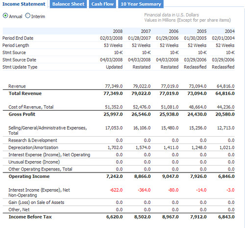
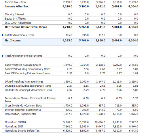
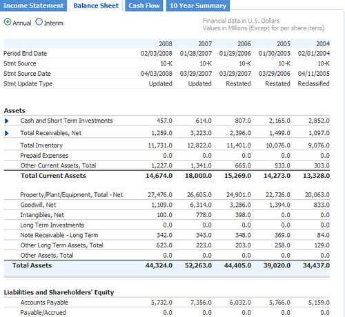

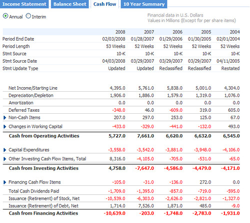
Now that the graphics are out of the way, let's crunch some numbers!
1. Net Income. The net income is 4,395.0. One point awarded.
2. Operating Cash Flow. It is also known as the net cash from operating activities. The operating cash flow is 5,727.0. One point awarded.
3. Return on Assets (net income divided by total assets). In 2008, the net income is 4,395.0 and the total assets are 44,324.0 for a ROA of 9.9%. In 2007, the net income was 5,761.0 and the total assets were 52,263.0 for a ROA of 11.0%. No point awarded.
4. Quality of Earnings. The net income is 4,395.0 and the operating cash flow is 5,727.0. One point awarded.
5. Total liabilities to Total Assets ratio. In 2008, the total liabilities are 26,610.0 and the total assets are 44,324.0 for a TL/A ratio of 60.0%. In 2007, the total liabilities were 27,233.0 and the total assets were 52,263.0 for a TL/A ratio of 52.1%. No point awarded.
6. Working Capital (current assets minus current liabilities). In 2008, the working capital is 14,674.0 (current assets) minus 12,706.0 (current liabilities), that is, 1,968.0. In 2007, it was 5,069.9. No point awarded.
7. Shares Outstanding. In 2008, the number of shares outstanding is 1,690.0. In 2007, it was 1,970.0. If you add 2% to the 2007 figure, you get 2,009.4. One point awarded.
8. Gross Margin (gross income divided by sales). In 2008, the gross margin is 25,997.0 (gross profit) divided by 77,349.0 (sales), that is, 33.6%. In 2007, the gross margin was 26,546.0/79,022.0=33.6%. No point awarded since it has stayed the same (although one could argue I suppose).
9. Asset Turnover (revenues divided by total assets). In 2008, the asset turnover is 77,349.0/44,324.0=174.5%. In 2007, the asset turnover is 79,022.0/52,263.0=151.2%. One point awarded.
10. Total liabilities to EBITDA (earnings before interest, taxes, depreciation and amortization) ratio. The total liabilities are 26,610.0 and the EBITDA is 9,148.0 for a ratio of 2.9. One point awarded.
11. Total Liabilities to Operating Cash Flow ratio. The total liabilities are 26,610.0 and the operating cash flow is 5,727.0 for a ratio of 4.6. One point awarded.
When the points are tallied, you get a total of 7 points for the home improvement store. Conclusion: Home Depot passes the financial strength test (for high debtors)!
We are gonna be looking at the income statement, balance sheet and cash flow for HD that are available at MSN Money (go to "financial results" and then "statements" after having entered the stock name in the quotes window). Here they are (the analysis will follow):
Now that the graphics are out of the way, let's crunch some numbers!
Profitability
1. Net Income. The net income is 4,395.0. One point awarded.
2. Operating Cash Flow. It is also known as the net cash from operating activities. The operating cash flow is 5,727.0. One point awarded.
3. Return on Assets (net income divided by total assets). In 2008, the net income is 4,395.0 and the total assets are 44,324.0 for a ROA of 9.9%. In 2007, the net income was 5,761.0 and the total assets were 52,263.0 for a ROA of 11.0%. No point awarded.
4. Quality of Earnings. The net income is 4,395.0 and the operating cash flow is 5,727.0. One point awarded.
Debt and Capital
5. Total liabilities to Total Assets ratio. In 2008, the total liabilities are 26,610.0 and the total assets are 44,324.0 for a TL/A ratio of 60.0%. In 2007, the total liabilities were 27,233.0 and the total assets were 52,263.0 for a TL/A ratio of 52.1%. No point awarded.
6. Working Capital (current assets minus current liabilities). In 2008, the working capital is 14,674.0 (current assets) minus 12,706.0 (current liabilities), that is, 1,968.0. In 2007, it was 5,069.9. No point awarded.
7. Shares Outstanding. In 2008, the number of shares outstanding is 1,690.0. In 2007, it was 1,970.0. If you add 2% to the 2007 figure, you get 2,009.4. One point awarded.
Operating Efficiency
8. Gross Margin (gross income divided by sales). In 2008, the gross margin is 25,997.0 (gross profit) divided by 77,349.0 (sales), that is, 33.6%. In 2007, the gross margin was 26,546.0/79,022.0=33.6%. No point awarded since it has stayed the same (although one could argue I suppose).
9. Asset Turnover (revenues divided by total assets). In 2008, the asset turnover is 77,349.0/44,324.0=174.5%. In 2007, the asset turnover is 79,022.0/52,263.0=151.2%. One point awarded.
Added Tests
10. Total liabilities to EBITDA (earnings before interest, taxes, depreciation and amortization) ratio. The total liabilities are 26,610.0 and the EBITDA is 9,148.0 for a ratio of 2.9. One point awarded.
11. Total Liabilities to Operating Cash Flow ratio. The total liabilities are 26,610.0 and the operating cash flow is 5,727.0 for a ratio of 4.6. One point awarded.
When the points are tallied, you get a total of 7 points for the home improvement store. Conclusion: Home Depot passes the financial strength test (for high debtors)!
Financial strength evaluation
In order to evaluate a company's financial strength, you fist need to figure out the debt level: is it low or high? Well, there's a ratio for it: total liabilities to shareholder's equity (equity in short, which is the total assets minus the total liabilities). If the TL/E is less than 0.5, the company is doing great as it has low debt. If the TL/E is 0.5 or higher, the company is a high-debtor and its finances should be looked at carefully considering the financial strength test for high-debt companies.
So now, we can focus on low-debt companies. You need to look at the operating cash flow and the working capital to evaluate the company's financial fitness. The working capital is the current assets (cash, inventories and accounts receivable) minus the current liabilities (accounts payable and short-term debt). Ideally, you want both of them to be positive. If the cash flow is positive and the working capital is negative, you have to make sure the operating cash flow exceeds the working capital deficit. If the cash flow is negative and the working capital is positive, you need to compute the monthly cash burn rate by dividing the operating cash flow by 12 and then see how many months the working capital can sustain the cash burn rate (divide the working capital by the burn rate). If there's enough cash to last two years, then the company might be ok.
All in all and as far as low-debt is concerned, it may a good idea to stick with companies that have positive operating cash flow and positive working capital. You don't have to of course.
Let's look at an example to hopefully clarify all this!
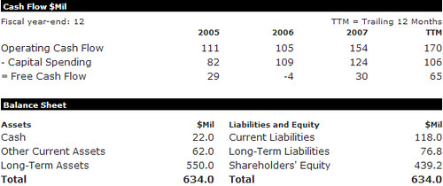
Cash flow and balance sheet for Panera Bread Company, Inc. PNRA obtained at morningstar by following the "quotes", "financial statements" and "5-yr restated" links.
The total liabilities equals Current Liabilities (118.0) plus Long-Term Liabilities (76.8), that is, 194.8. The shareholders' equity is 439.2. This gives a TL/E ratio of 0.44. Oh boy, we have uncovered a low-debt company! Let's look at operating cash flow and working capital to check if the company is financially sound.
The operating cash flow is 170 (always look at the trailing twelve-month TTM figure). The working capital is the sum of Cash (22.0) and Other Current Assets (62.0) minus Current Liabilities (118.0), that is, -34.0. We have positive operating cash flow but negative working capital. Because the TTM operating cash flow is (much) greater than the working capital deficit, Panera Bread passes the financial strength test for low-debt companies (not with flying colors though).
So now, we can focus on low-debt companies. You need to look at the operating cash flow and the working capital to evaluate the company's financial fitness. The working capital is the current assets (cash, inventories and accounts receivable) minus the current liabilities (accounts payable and short-term debt). Ideally, you want both of them to be positive. If the cash flow is positive and the working capital is negative, you have to make sure the operating cash flow exceeds the working capital deficit. If the cash flow is negative and the working capital is positive, you need to compute the monthly cash burn rate by dividing the operating cash flow by 12 and then see how many months the working capital can sustain the cash burn rate (divide the working capital by the burn rate). If there's enough cash to last two years, then the company might be ok.
All in all and as far as low-debt is concerned, it may a good idea to stick with companies that have positive operating cash flow and positive working capital. You don't have to of course.
Let's look at an example to hopefully clarify all this!
Cash flow and balance sheet for Panera Bread Company, Inc. PNRA obtained at morningstar by following the "quotes", "financial statements" and "5-yr restated" links.
The total liabilities equals Current Liabilities (118.0) plus Long-Term Liabilities (76.8), that is, 194.8. The shareholders' equity is 439.2. This gives a TL/E ratio of 0.44. Oh boy, we have uncovered a low-debt company! Let's look at operating cash flow and working capital to check if the company is financially sound.
The operating cash flow is 170 (always look at the trailing twelve-month TTM figure). The working capital is the sum of Cash (22.0) and Other Current Assets (62.0) minus Current Liabilities (118.0), that is, -34.0. We have positive operating cash flow but negative working capital. Because the TTM operating cash flow is (much) greater than the working capital deficit, Panera Bread passes the financial strength test for low-debt companies (not with flying colors though).
Financial strength test for high-debt companies
Joseph Piotroski, an accounting professor at the University of Chicago, devised a financial fitness scoring system in order to determine whether a company is financially weak. Although his scoring system is intended for value (distressed) stocks, it can be applied to any high-debt company. If the total liabilities to equity (total assets minus the total liabilities) ratio is higher than 0.5, the company is considered a high-debtor (see the financial strength evaluation post). Harry Domash, an expert in analyzing stocks (see his winning investing website), very slightly modified the Piotroski test (added two additional tests) and this is his system that is presented here below. The way it works is that you award one point if the company passes each test and tally the points at the end. It is of course a bit simplistic since there is no weighting for the various tests (not all tests are equal regarding what conclusions can be drawn from them) but it is certainly better than nothing.
1. Net Income. Award one point if the net income is positive.
2. Operating Cash Flow. Award one point if the operating cash flow is positive.
3. Return on Assets (net income divided by total assets). Award one point for a year-over-year increase.
4. Quality of Earnings. Award one point if the operating cash flow is greater than the net income.
5. Total liabilities to Total Assets ratio. Award one point for a year-over-year decrease. Note that Piotroski uses long term debt instead of total liabilities.
6. Working Capital (current assets minus current liabilities). Award one point for a year-over-year increase.
7. Shares Outstanding. Award one point if the number of shares outstanding increased by less than 2 percent. Note that Piotroski requires the number of shares outstanding to not increase at all.
8. Gross Margin (gross income divided by sales). Award one point for a year-over-year increase.
9. Asset Turnover (revenues divided by total assets). Award one point for a year-over-year increase.
10. Total liabilities to EBITDA (earnings before interest, taxes, depreciation and amortization) ratio. This ratio is known as the investment quality ratio in the lending business. Award one point if the ratio is 5 or lower. Deduct one point if the ratio is 8 or above.
11. Total Liabilities to Operating Cash Flow ratio. Award one point if the ratio is less than 4.
There you have it! All you need to do is tally up the scores. A company scoring 5 points or more receives a passing grade (same as Piotroski). Of course, the higher the score, the better. A company with a failing score is not guaranteed to go bankrupt but staying away from it would be a good idea. Please check the financial strength test for high-debt companies (example) post for how it works in real life.
Profitability
1. Net Income. Award one point if the net income is positive.
2. Operating Cash Flow. Award one point if the operating cash flow is positive.
3. Return on Assets (net income divided by total assets). Award one point for a year-over-year increase.
4. Quality of Earnings. Award one point if the operating cash flow is greater than the net income.
Debt and Capital
5. Total liabilities to Total Assets ratio. Award one point for a year-over-year decrease. Note that Piotroski uses long term debt instead of total liabilities.
6. Working Capital (current assets minus current liabilities). Award one point for a year-over-year increase.
7. Shares Outstanding. Award one point if the number of shares outstanding increased by less than 2 percent. Note that Piotroski requires the number of shares outstanding to not increase at all.
Operating Efficiency
8. Gross Margin (gross income divided by sales). Award one point for a year-over-year increase.
9. Asset Turnover (revenues divided by total assets). Award one point for a year-over-year increase.
Added Tests
10. Total liabilities to EBITDA (earnings before interest, taxes, depreciation and amortization) ratio. This ratio is known as the investment quality ratio in the lending business. Award one point if the ratio is 5 or lower. Deduct one point if the ratio is 8 or above.
11. Total Liabilities to Operating Cash Flow ratio. Award one point if the ratio is less than 4.
There you have it! All you need to do is tally up the scores. A company scoring 5 points or more receives a passing grade (same as Piotroski). Of course, the higher the score, the better. A company with a failing score is not guaranteed to go bankrupt but staying away from it would be a good idea. Please check the financial strength test for high-debt companies (example) post for how it works in real life.
Sunday, August 31, 2008
Operating cash flow
The operating cash flow is probably a better indicator of a company's profitability than the almighty earning because it shows how much money the company has in the bank (at the end of the reporting period) and if the bills can be paid with cash. It is computed by taking the net income and adding non-cash items that were subtracted (to the net income) and subtracting non-cash items that were added.
Depreciation and amortization (process of spreading out the cost of an asset over its useful lifetime) is a good example of expenses that show up completely differently whether you are looking at the income statement or the cash flow statement. Say, the company buys a piece of equipment for $5,000 cash and spreads out the expense over 5 years ($1,000 per year), the income statement will show a $1,000 expense every year whereas the cash flow statement will show the initial $5,000 expense in the first year (subtract $4,000 from income in the first year and add $1,000 afterwards).
The net income must be adjusted principally because of changes in the working capital (current assets minus current liabilities), in particular, inventories, accounts receivable and accounts payable. An inventory increase adds to the assets in the income statement. This increase is subtracted from the cash flow (since it does not generate any cash). Similarly, an inventory decrease subtracts from the assets in the income statement. This decrease is added to the cash flow (since it has generated cash). When a company sells a product that is not to be paid before the end of the reporting period, the selling price is added to the accounts receivable as asset in the income statement. In the cash flow statement, the selling price is deducted from the cash flow because cash has not actually been received for it. Similarly, when a company buys a product that is not to be paid before the end of the reporting period, the buying price is added to the accounts payable as liability in the income statement. In the cash flow statement, the buying price is added to the cash flow because cash has not actually been given. Regarding accounts receivable and payable, if goods were sold and bought with money changing hands within the reporting period, this difference between net income and operating cash flow would not exist.
Operating cash flow should be larger than the net income because depreciation and amortization reduce the income but not the cash flow. If it is not, then something is amiss and items like inventories, accounts receivable and payable should be looked at carefully since they may have been manipulated to bump the earnings.
Friday, August 15, 2008
Call options
When you buy a call option, you obtain the right to buy the underlying stock (100 shares per option contract) at the strike price until the option expires. That's all nice and dandy but what's good about call options is that you participate in the market at the fraction of the price (it's called leverage). If the stock is priced at $50, instead of buying 100 shares of stock for $5,000, you can buy the corresponding option for much less (we'll see an example a tad later). Because of that, the returns (or losses) on options can be much more consequent than the returns (or losses) on the underlying stocks.
The call option value is made up of intrinsic value and time value. The intrinsic value is the difference between the stock price and the strike price. So, if a stock is priced at $21 and the strike price is $20, the intrinsic value is $1. When the stock price is higher than the strike price, the option call is said to be in the money. The time value is usually made up of the true time value and the extrinsic value. The true time value diminishes as the call option nears the expiration date. The extrinsic value depends on a bunch of factors, the two most important being the stock price itself and the implied volatility. There are books about how options are valued so I certainly won't delve into it here.
When the option call is in the money, the option value kinda follows the stock price movement. How close the option follows the stock depends upon what is called the delta. The closer the option delta is to 1, the closer the option price follows the stock price. That's a very good thing!
The bad thing about a call option is that you have two things going against you. First, you have time (true time value diminishes exponentially as the expiration date gets closer) to fight against. Second, you have to beat the spread (difference between the bid and the ask). Indeed, you usually buy at the ask price and sell at the bid price and the difference is the spread which never goes into your pocket. The more volatile the stock, the larger the spread.
Let's look at a call option chain to make things more interesting. To get option quotes, it is a good idea to visit the Options Industry Council and enter your favorite stock in the quotes section.
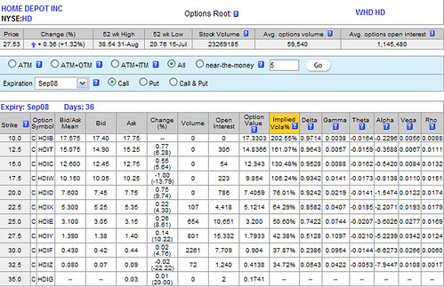
We are looking at the Home Depot (HD) call option chain (just showing the call options expiring in September 08). If you look at the $25 strike price option, you can buy it for 100x$3.15=$315 and it's pretty much like owning 100 shares of that good old HD stock. So instead of spending $2,753 to own 100 shares of HD, you just spend a mere 315 bucks for about the same thing (well, not quite since for one thing, you ain't gonna get any dividends). The volume represents the number of options traded today. The open interest is the number of options that have not yet been closed (in other words, are still open). You can see that the more in the money the option, the higher the delta and the more expensive (because of bigger intrinsic value). The implied volatility kinda tells you if the option is overpriced (high volatility means that the price may move quite a bit and you always pay a premium for that). The option value is computed using some formula where the unknown is the implied volatility, so the two kinda depend upon each other. It's put in there to help you decide whether the option is undervalued or overvalued (or just right).
In short-term trading, it is not recommended (although quite tempting) to buy out of the money options. Concerning the expiration date, it is a good idea to buy options that do not expire in the month during which you are planning to buy (the following month should be fine).
The call option value is made up of intrinsic value and time value. The intrinsic value is the difference between the stock price and the strike price. So, if a stock is priced at $21 and the strike price is $20, the intrinsic value is $1. When the stock price is higher than the strike price, the option call is said to be in the money. The time value is usually made up of the true time value and the extrinsic value. The true time value diminishes as the call option nears the expiration date. The extrinsic value depends on a bunch of factors, the two most important being the stock price itself and the implied volatility. There are books about how options are valued so I certainly won't delve into it here.
When the option call is in the money, the option value kinda follows the stock price movement. How close the option follows the stock depends upon what is called the delta. The closer the option delta is to 1, the closer the option price follows the stock price. That's a very good thing!
The bad thing about a call option is that you have two things going against you. First, you have time (true time value diminishes exponentially as the expiration date gets closer) to fight against. Second, you have to beat the spread (difference between the bid and the ask). Indeed, you usually buy at the ask price and sell at the bid price and the difference is the spread which never goes into your pocket. The more volatile the stock, the larger the spread.
Let's look at a call option chain to make things more interesting. To get option quotes, it is a good idea to visit the Options Industry Council and enter your favorite stock in the quotes section.
We are looking at the Home Depot (HD) call option chain (just showing the call options expiring in September 08). If you look at the $25 strike price option, you can buy it for 100x$3.15=$315 and it's pretty much like owning 100 shares of that good old HD stock. So instead of spending $2,753 to own 100 shares of HD, you just spend a mere 315 bucks for about the same thing (well, not quite since for one thing, you ain't gonna get any dividends). The volume represents the number of options traded today. The open interest is the number of options that have not yet been closed (in other words, are still open). You can see that the more in the money the option, the higher the delta and the more expensive (because of bigger intrinsic value). The implied volatility kinda tells you if the option is overpriced (high volatility means that the price may move quite a bit and you always pay a premium for that). The option value is computed using some formula where the unknown is the implied volatility, so the two kinda depend upon each other. It's put in there to help you decide whether the option is undervalued or overvalued (or just right).
In short-term trading, it is not recommended (although quite tempting) to buy out of the money options. Concerning the expiration date, it is a good idea to buy options that do not expire in the month during which you are planning to buy (the following month should be fine).
Exit strategy
As you may have noticed, not all double bottom patterns materialize but when they do the returns can be substantial. In order not to lose your shirt, you have to establish a few trading rules that you, the trader, should follow.
When you enter the trade, you should set a stop-loss order (aka protective stop) at the same time so that you can exit the trade automatically when things go south and the losses are still small. It is extremely dangerous to let the stock go down especially when it is already in a downtrend. Once the stock climbs up, you can move the stop higher to protect your profits. It should be noted that if the stock gaps open to the downside, a protective stop order will get filled at a price significantly lower than the one that was set. So be aware that a stop order does not fully protect you against price drops. Since dramatic gapping can happen after a company releases its earnings report, it is a good idea to think twice about entering a trade prior to a company news release (of the financial type) unless you know a lot about the company.
Before you enter the trade, you should also know at what price you will sell the security (at a profit, hopefully). If you don't have a plan and the stock climbs, greed takes over and there is a tendency in everybody to think more profits can be made and stay in the trend (usually too long). It is better to leave the trade as planned even if you are missing out on some profits.
Short interest ratio (SIR) and the short squeeze
The short interest ratio (SIR) for a given equity is the ratio of the total number of shares that have been shorted (short interest) to the average daily volume. The short interest ratio is also known as the days to cover since it represents how many days it would take for short sellers to cover (buy) their positions.
As a reminder, a short seller is someone that sells an equity in the hope that he can buy it back later at a lower price. In other words, he's betting for the price to go down. Every short seller will at some point have to buy the stock he shorted. This means the short sellers are a guaranteed source of demand (which can drive the price higher if the stars align properly).
The short interest for a given equity, the total number of shares that have been shorted, is computed at mid-month and end of month (it used to be just at mid-month but since September 2007, it's also available at end of month as well) by the stock exchanges and made public some time later. It can be charted as an overlay on your stock charts to see trends in short selling.
When the short interest ratio is high, it means that the short sellers could be in big trouble if the stock they have sold short goes in an uptrend. When the short sellers start covering in numbers, the famed "short squeeze" occurs and prices can really move up. The short interest ratio is a contrarian indicator since the higher it is, the more people think the underlying stock will go down (since they have shorted a lot) but it is usually used as a long trade entry decision tool. You are pretty much saying the short sellers were wrong or at least, had bad timing.
The "short squeeze" may happen when the stock is in an uptrend (stock is trading above a rising 50-day moving average for example) and the short interest ratio is relatively high. If you can figure out when the short sellers entered the trade (usually when a stock experiences a top reversal), the trade entry price can be seen as support since the short sellers will likely cover their positions once the stock goes back up to the entry price (to break even and avoid losses). Charting the monthly short interest on a stock chart can give you clues as to when the shorts sellers entered trades.
To find the short interest and short interest ratio for a given stock, you need to go to NASDAQ short interest and enter the stock of your choice in the search box. Even though it's coming from the NASDAQ stock exchange, it will give you short interest info for any stock, not just NASDAQ stocks.
Saturday, August 2, 2008
Double top
The double top pattern is the mirror image of the double bottom pattern. The former is bearish, the latter bullish.
On your typical chart, the double top looks like the letter "M". The first leg is a sustained uptrend, the second leg a pullback, the third an attempt by the bulls to pass the resistance line created by the first top (in short, an uptrend) and the fourth a push downwards by the bears (in other words, a downtrend).
A double top is considered complete when the fourth leg passes by (on its way down) the support line defined by the middle low. In this blog, double tops will be shown in their incomplete states, that is, without the fourth leg.
Why? You may ask. Kinda like the idea of detecting the formation of a pattern as early as possible. If you prefer to wait for pattern completion, well, all you have to do is keep an eye on the equity of interest and get on it later. Getting in early maximizes potential profit but it is of course riskier, as always.
It should be noted that the double top does not occur as often as the double bottom, at least from what I can tell. So you probably will see a lot more double bottoms on this blog than double tops.
Saturday, July 12, 2008
Bollinger bands
The Bollinger bands are used to display stock price volatility on a chart. They are: the middle band, which is a simple moving average (SMA), the upper band, which is the SMA plus the standard deviation (times 2) and the lower band, which is the SMA minus the standard deviation (times 2). For more info on moving averages, please take a look at the moving averages post. The Bollinger bands were created by a fellow named John Bollinger and we thank him for that.
Let's say talk for a moment about standard deviation since it is at the heart of those Bollinger bands. Standard deviation is, as its name implies, a measure of how much sample values differ from the average. For each period (day on a daily chart), the deviation is obtained by subtracting the simple moving average (SMA) from the price. If you take the sum of the squared deviations divided by the number of periods and then the square root of that number, you obtain the standard deviation. Standard deviation indicates volatility, that is, how much the price varies from its average. The more it varies, the more volatile the stock is (more possible returns but also more risk). The less it varies, the less volatile the stock is (less risk but also less possible returns).
The Bollinger bands give an immediate idea of how volatile the stock is. The wider the bands are, the more volatile the stock is. Inversely, the narrower the bands, the less volatile the stock is. Volatility is important in short-term trading since the more volatile the stock is, the more important the returns can be and the more risky the trade can be. Volatility is also key in stock option pricing but we will not delve into this fascinating subject ... for now!
The Bollinger bands can also be used as a trade decision tool. If the price walks up/down the band (the prices are touching or slightly breaking the upper band in an uptrend or the lower band in a downtrend), the Bollinger bands are giving a continuation signal. When the price moves away from the band it is walking up/down, it is a possible signal the trend is running out of steam. A buy signal can be forthcoming when the price forms a double bottom into the low zone (between the middle and lower bands) and the second low doesn't break the lower band. The signal is confirmed when the price breaks the middle band to the upside. Similarly, a double top in the high zone (between the middle and the upper bands) indicates a signal to sell when the price dips below the middle band. When the bands contract (squeeze), a breakout is imminent but you usually don't know in which direction the stock is gonna go unless a price pattern is also present. A contraction of the bands, indicating lower volatility, may lead to a spectacular uptrend or downtrend.
Friday, July 11, 2008
Stochastic oscillator (%K)
The stochastic oscillator (%K) is a momentum indicator that indicates the price position relative to the high-low range over x periods. Mathematically speaking, it is the ratio of the day's close minus the lowest low (over x periods) to the high-low range (highest high minus the lowest low over the same x periods). The ratio is multiplied by 100 to get an oscillator ranging from 0 to 100. The stochastic oscillator was developed by a fellow named George C. Lane in the late 1950s.
The %K is equal to 0 when the day's close is equal to the lowest low. It is equal to 100 when the day's close is equal to the highest high.
The zone below 20 is called the oversold zone and the zone above 80 is referred to as the overbought zone. Those names may sound dramatic but be aware that having the oscillator in the oversold zone does not mean it's a signal to buy (the price could still fall). Similarly, the oscillator in the overbought zone is not by itself a bearish signal to sell since the price could keep going up. It is when the oscillator gets out of the zones that it gives the buy/sell signals. When the oscillator is in the oversold zone and hooks up past the 20% line, it gives a buy signal. Similarly, when the oscillator is in the overbought zone and hooks down past the 80% line, it gives a sell signal. Be aware of false signals though!
The signals are stronger if the oscillator and the stock price diverge. If the oscillator is in the oversold zone and there is positive divergence between the %K and the price (stock goes down while oscillator goes up), the crossing of the 20% line gives a (stronger) signal to buy. Similarly, if the oscillator is in the overbought zone and there is divergence between the oscillator and the stock price (negative divergence as the stock goes up while oscillator hooks down), the crossing of the 80% line is a (stronger) signal to sell. When using divergence as a trading decision tool, it usually takes two crossings for the signal to be valid (in other words, it is a good idea to disregard the first crossing).
An other way to get signals is to consider crossovers with the moving average (called %D) of the %K stochastic oscillator. As with crossovers between the stock price and its moving average, when the %K crosses the %D, it indicates the end of a trend (for the %K) and possibly a buy/sell signal.
There are two types of stochastic oscillators: slow and fast. The %K (fast) is computed using x periods as described above and the %D (fast) is a y-day SMA of the %K (fast). The %K (slow) is a 3-day SMA of the %K (fast) and the %D (slow) is a y-day SMA of the %K (slow). X is usually 14 and y is usually 3. The slow stochastic oscillate less than the the fast one since it is a smoothed version. There's actually a third stochastic oscillator, called full, but we won't go into its details since it's confusing enough with the slow and the fast.
Thursday, July 10, 2008
Relative strength index (RSI)
The Relative Strength Index (RSI) is a momentum indicator that was developed by a fellow named J. Welles Wilder. Its calculation requires the average up move and down move over the last x periods (days on a daily chart). As a reminder, you have an up move whenever the close of the day is higher than the close of the day before (up day); same idea for the down move.
To get the RSI, you calculate the ratio of the average up move to the average down move, add 1, invert the result, multiply by 100 and finally subtract the number obtained from 100. By adding 1 to the ratio, you make sure the result is greater than 1. Inverting a number greater than 1 gets you a number between 0 and 1. You end up with an indicator that ranges from 0 to 100, in other words, an oscillator.
If the average up move is equal to the down move, the RSI is equal to 50. The greater the average up move (compared to the down move), the closer the RSI is to 100. Similarly, the greater the average down move (compared to the up move), the closer the RSI is to 0. When the RSI is above 70, the security is considered overbought, that is, everybody that wanted to buy has done so; it is a signal to sell. When the RSI goes below 30, the stock is seen as oversold; it is a buy opportunity.
Buy and sell signals can also be obtained from divergences between the RSI and the stock price. When the Relative Strength Index shows divergence with the stock price, it usually indicates that the current price trend is wearing off. For example, if the RSI dives down while the stock price is in an uptrend, it can be assumed the trend will end soon and that profit should be taken (sooner than later).
Wednesday, July 9, 2008
Rate of change (ROC)
The rate of change (ROC) is a momentum= indicator showing price acceleration. Mathematically, it is today's close minus the close from x periods (days) ago divided by the close from x periods ago and multiplied by 100. It is considered an oscillator because it is normalized (expressed as a percentage).
It is equal to zero when the price remains the same, is positive when the price is in an uptrend and negative when the price is in a downtrend.
When the price increases by larger amounts (comparing today's close to the close from x periods ago), the ROC is positive and is itself in an uptrend. When the price of the underlying security increases by the same amount, the ROC is positive and horizontal. When the price increases by smaller amounts, the ROC is positive and in a downtrend. It is important to realize that the price of the stock can be an uptrend while the ROC is itself in a downtrend (divergence). The ROC crossing the zero line going down indicates the end of the stock price uptrend and is a signal to sell.
Similarly, when the price decreases by larger amounts, the ROC is negative and in a downtrend. When the price decreases by the same amount, the ROC is negative and constant. When the price decreases by smaller amounts, the ROC is negative and in an uptrend. The crossing of the zero line by the ROC going upward indicates the end of a downtrend; it is a signal to buy.
Monday, July 7, 2008
Moving average convergence-divergence (MACD)
The moving average convergence-divergence (MACD) is a trend indicator that subtracts the slow moving average (long-term) from the fast moving average (short-term). Please consult moving averages for more information on slow on fast moving averages.
Let's go into the details of the MACD as a trading tool in the case of an uptrend (which implies going long on a stock). You can easily deduce the mechanics of shorting a stock using the MACD in case of a downtrend. Be aware that shorting a stock is tad riskier than longing a stock since the losses can be (in theory) infinite.
In an established uptrend, the MACD is positive since the fast moving average is above the slower one. What's interesting is that the MACD goes up (MACD's own uptrend) when the two moving averages diverge and goes down (MACD's own downtrend) when they converge, hence the "convergence-divergence" in the name of the indicator. If you convince yourself that the best time to exit a long trade (which you entered in the hope the price will go higher) is when the two moving averages start to converge (instead of waiting until they actually cross), then it makes sense to exit when the MACD's uptrend is over.
How do you detect when the MACD's uptrend is over? It's the exact same principle as when you are trying to detect the end of a price uptrend using its moving average. Indeed, you detect the end of the MACD's uptrend (not to be confused with the stock price's uptrend) with a moving average (of the MACD)!
The moving average of the MACD is called the signal or trigger line. When the MACD crosses above its average, the MACD is in an uptrend and that's where you should buy (assuming you are going long). When the MACD crosses its average to the downside, you sell the stock. By using the MACD and its trigger instead of the two moving averages, you enter the trade a tad late but exit the trade much earlier, closer to the actual reversal (if all goes well).
The MACD cannot really be used alone as a trade decision tool (although some people do). It should be considered along with other indicators.
Moving averages
The moving average indicator for a given security is, as its name implies, the average of past stock prices (the closes). The period (10, 20, 50 days, etc) indicates how many days the moving average looks back. There are different types of moving averages: simple (SMA), weighted (WMA), exponential (EMA=), etc. The important thing about moving averages is that they smooth out the stock prices and that they are always lagging.
When the stock is in an established uptrend, the price is above the moving average (most of the time). This is due to the fact that the MA averages past prices: when you average prices that go up to the current day's price, you are going to get a lower price than the current day's price. In a downtrend, it's the exact opposite as the price is under its moving average.
It is fair to say that when the price crosses the moving average to the upside, the stock is trending up and the crossover is an excellent entry point for a long trade. When the price crosses the moving average again (to the downside), this is a signal to exit the position. The price/moving average crossover method is a reasonable trade decision tool but it may suffer from whipsaws when the price briefly goes below the average signaling a "false" reversal.
To eliminate the whipsaw effect, two moving averages (one fast and one slow) are considered. In an uptrend, the faster (short-term) moving average rides above the slower (long-term) one. In a downtrend, it's the opposite. If you want to use this two moving average trade decision tool, you enter a long trade when the faster moving average crosses over the slower one and you sell when the faster moving average dips below the slower one. Because the moving averages are always lagging, the exit signal usually occurs when the stock price has already dipped past the top of the uptrend. The same process applies to shorting a stock but you obviously have to consider the opposite signals.
Tuesday, July 1, 2008
On-balance volume (OBV)
The on-balance volume (aka OBV) is a running volume indicator. If the day's close is higher than the day before, the day's volume of trades shared is added to the OBV. If it is lower, it is subtracted. In other words, the OBV goes up if the stock has an up-day and down if the stock has a down-day. Pretty simple!
The on-balance volume assumes that all shares traded during an up-day are buys that drove the price up. This demands a little bit of explanation since, last I've heard, for every buy, there is obviously a corresponding sell, so how can the trades be all considered as buys? On an up-day, demand is greater than supply, meaning buyers are willing to pay more for a security. Sellers are more than happy to oblige and sell at the higher prices. In other words, the buyers are willing to buy at higher prices but the sellers sell just because the demand is there and not because of fear. This is why you add the volume to the OBV when the stock closed higher than the day before. It is of course quite a simplification since the volume on a up day is certainly not all net buying.
Similarly, the on-balance volume assumes that all shares traded during a down-day are sells that brought the price down. This is the reason why you subtract the volume to the OBV on a down day.
What you are looking for in the OBV graph is divergence, that is, when the stock goes one way and the on-balance volume goes the other indicating a possible key reversal coming up. For example, if the stock you are screening is in a down trend and the OBV is starting to display an up trend of its own, a pivot point that would end the stock's down trend may be near.
As always with indicators, they are not always right. Actually, they are probably 50% right at best. So, it is good to know about them but do not put too much faith into them especially the rather simplistic OBV. Note that there are other more sophisticated volume indicators out there, in particular, the Chaikin's indicators but they are for you to discover (or a later post if this blog is still around).
Subscribe to:
Posts (Atom)